样式
App.axaml
<Application xmlns="https://github.com/avaloniaui"
             xmlns:x="http://schemas.microsoft.com/winfx/2006/xaml"
             x:Class="_08_Styles.App">

  <Application.Styles>
    <FluentTheme />
  </Application.Styles>

  <Application.Resources>
    <ResourceDictionary>
      <SolidColorBrush x:Key="PrimaryBrush" Color="#6200EE"/>
      <SolidColorBrush x:Key="SecondaryBrush" Color="#03DAC6"/>
      <SolidColorBrush x:Key="DangerBrush" Color="#CF6679"/>
      <SolidColorBrush x:Key="SuccessBrush" Color="#4CAF50"/>
    </ResourceDictionary>
  </Application.Resources>

</Application>
MainWindow.axaml
<Window xmlns="https://github.com/avaloniaui"
xmlns:x="http://schemas.microsoft.com/winfx/2006/xaml"
x:Class="_08_Styles.MainWindow"
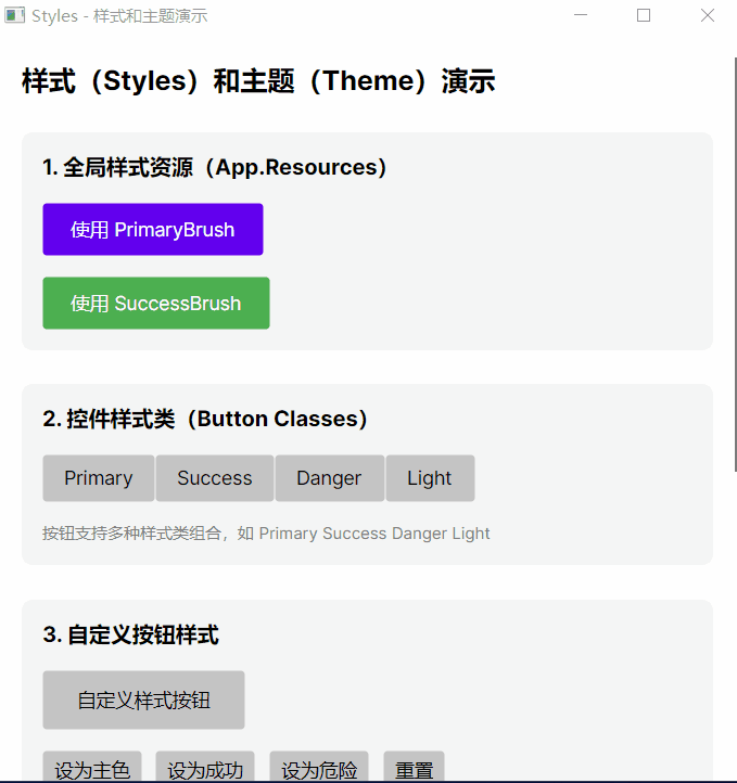
Title="Styles - 样式和主题演示"
Width="550"
Height="550">
<ScrollViewer>
<StackPanel Margin="20" Spacing="25">
<TextBlock Text="样式(Styles)和主题(Theme)演示" FontSize="20" FontWeight="Bold"/>
<Border Background="#F5F5F5" Padding="15" CornerRadius="8">
<StackPanel Spacing="15">
<TextBlock Text="1. 全局样式资源(App.Resources)" FontSize="16" FontWeight="Bold"/>
<Button Content="使用 PrimaryBrush"
Background="{DynamicResource PrimaryBrush}"
Foreground="White"
Padding="20,10"/>
<Button Content="使用 SuccessBrush"
Background="{DynamicResource SuccessBrush}"
Foreground="White"
Padding="20,10"/>
</StackPanel>
</Border>
<Border Background="#F5F5F5" Padding="15" CornerRadius="8">
<StackPanel Spacing="15">
<TextBlock Text="2. 控件样式类(Button Classes)" FontSize="16" FontWeight="Bold"/>
<WrapPanel >
<Button Content="Primary" Classes="Primary" Padding="15,8"/>
<Button Content="Success" Classes="Success" Padding="15,8"/>
<Button Content="Danger" Classes="Danger" Padding="15,8"/>
<Button Content="Light" Classes="Light" Padding="15,8"/>
</WrapPanel>
<TextBlock Text="按钮支持多种样式类组合,如 Primary Success Danger Light"
FontSize="12" Foreground="Gray"/>
</StackPanel>
</Border>
<Border Background="#F5F5F5" Padding="15" CornerRadius="8">
<StackPanel Spacing="15">
<TextBlock Text="3. 自定义按钮样式" FontSize="16" FontWeight="Bold"/>
<Button x:Name="CustomButton"
Content="自定义样式按钮"
Padding="25,12"/>
<StackPanel Orientation="Horizontal" Spacing="10">
<Button x:Name="SetPrimaryBtn" Content="设为主色" Click="OnSetPrimary"/>
<Button x:Name="SetSuccessBtn" Content="设为成功" Click="OnSetSuccess"/>
<Button x:Name="SetDangerBtn" Content="设为危险" Click="OnSetDanger"/>
<Button x:Name="ResetBtn" Content="重置" Click="OnReset"/>
</StackPanel>
</StackPanel>
</Border>
<Border Background="#F5F5F5" Padding="15" CornerRadius="8">
<StackPanel Spacing="15">
<TextBlock Text="4. 内置主题切换" FontSize="16" FontWeight="Bold"/>
<TextBlock Text="当前使用 FluentTheme,可在 App.axaml 中切换为 SimpleTheme"
TextWrapping="Wrap"/>
<StackPanel Orientation="Horizontal" Spacing="10">
<TextBlock Text="主题示例:" VerticalAlignment="Center"/>
<Border Background="#6200EE" Padding="10,5" CornerRadius="4">
<TextBlock Text="Fluent" Foreground="White" FontSize="12"/>
</Border>
</StackPanel>
</StackPanel>
</Border>
<Border Background="#E3F2FD" Padding="15" CornerRadius="8">
<StackPanel Spacing="10">
<TextBlock Text="学习要点" FontSize="16" FontWeight="Bold" Foreground="#1565C0"/>
<TextBlock Text="- ResourceDictionary:定义全局可复用的资源(画刷、颜色等)"
TextWrapping="Wrap"/>
<TextBlock Text="- 控件样式类(Classes):为控件添加预定义的样式组合"
TextWrapping="Wrap"/>
<TextBlock Text="- DynamicResource:引用动态资源,运行时可更改"
TextWrapping="Wrap"/>
<TextBlock Text="- 主题:Avalonia 内置 FluentTheme 和 SimpleTheme 两种主题"
TextWrapping="Wrap"/>
</StackPanel>
</Border>
</StackPanel>
</ScrollViewer>
</Window>MainWindow.axaml.cs
using Avalonia;
using Avalonia.Controls;
using Avalonia.Media;

namespace _08_Styles;

public partial class MainWindow : Window
{
    private readonly SolidColorBrush _primaryBrush = new(Color.Parse("#6200EE"));
    private readonly SolidColorBrush _successBrush = new(Color.Parse("#4CAF50"));
    private readonly SolidColorBrush _dangerBrush = new(Color.Parse("#CF6679"));
    private readonly SolidColorBrush _defaultBrush;

    public MainWindow()
    {
        InitializeComponent();
        _defaultBrush = (SolidColorBrush)CustomButton.Background!;
    }

    private void OnSetPrimary(object? sender, Avalonia.Interactivity.RoutedEventArgs e)
    {
        CustomButton.Background = _primaryBrush;
        CustomButton.Foreground = Brushes.White;
    }

    private void OnSetSuccess(object? sender, Avalonia.Interactivity.RoutedEventArgs e)
    {
        CustomButton.Background = _successBrush;
        CustomButton.Foreground = Brushes.White;
    }

    private void OnSetDanger(object? sender, Avalonia.Interactivity.RoutedEventArgs e)
    {
        CustomButton.Background = _dangerBrush;
        CustomButton.Foreground = Brushes.White;
    }

    private void OnReset(object? sender, Avalonia.Interactivity.RoutedEventArgs e)
    {
        CustomButton.Background = _defaultBrush;
        CustomButton.Foreground = Brushes.Black;
    }
}
效果: